
Our name
The name domoXim is anything but a coincidence.
- domo refers to Esperanto, an international language developed to help people from different backgrounds communicate more easily. Domo simply means ‘house’ – the place where everything comes together.
- The X is at the center of our name and refers to our focus since the very start: expats. International renters and buyers who live in Belgium temporarily or permanently. For them, a home is more than a place to stay – it’s a new home.
- im speaks for itself: immo, immobiliën, real estate. Our core business.
Together, this forms the essence of who we are:
a real estate agency that connects people, across borders.
Our colors
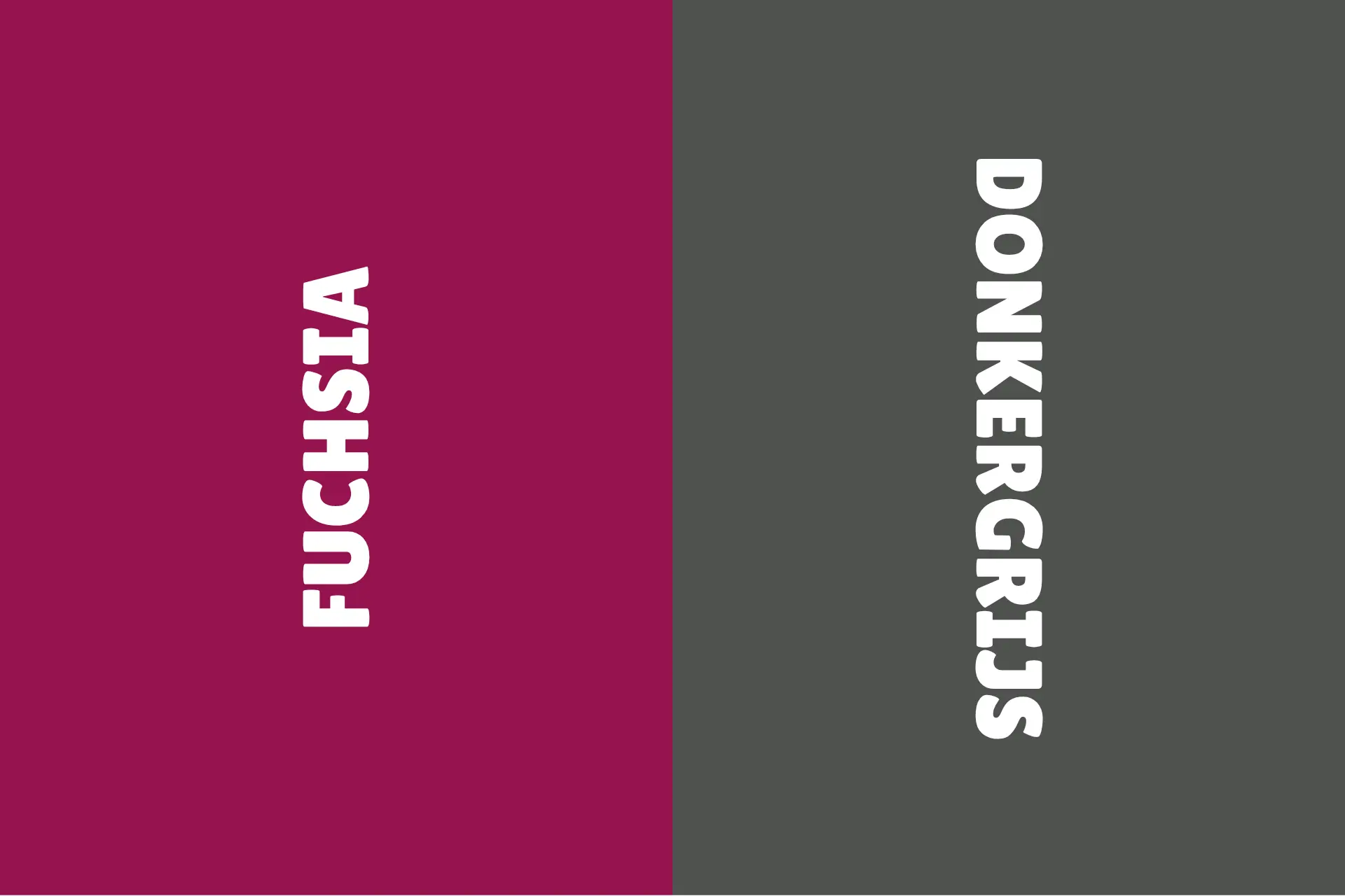
Our colors are more than a recognizable logo – they tell you what we stand for.
Fuchsia is our signature color:
- a combination of red (energy, passion, drive)
- and purple (trust, quality, luxury)
👉 The result? A color that stands out, sparks energy, and conveys trust – just like our approach.
Dark gray provides the perfect balance:
- stands for stability
- professionalism
- a no-nonsense approach
Together, these colors ensure a balance between dynamism and reliability.
.jpg?format=webp&width=1920&height=auto)
Our vision
domoXim is an independent real estate agency with a clear mission:
to offer personal, honest, and professional guidance, without frills.
Today, our clients expect more:
- clear communication
- a partner who thinks along with you
- someone who is reachable and takes the time
👉 That’s exactly where we make the difference.
No slick sales talk, but real, human-to-human guidance..